This story was originally published in 2013.
In 1996, graphic designer P.R. Brown was working as a creative director at a New York film studio when a friend recommended him to Marilyn Manson. The artist formerly known as Brian Warner was recording his band's second full-length, Antichrist Superstar, with Trent Reznor in New Orleans and was looking for someone to design the cover.

"To be honest, I never showed Manson any of my previous work," Brown tells Revolver. "Most of the albums I had designed up until that point were jazz albums. When I heard about the possibility and looked into who and what he was, I realized it would have been pointless to show him jazz albums. Instead, I spent a weekend creating fictitious album covers for made-up bands. After I created those covers, I sent them off to Manson and didn't hear anything for months. Then one day I got a call asking if I could fly down to New Orleans to meet him at Reznor's studio."
When Brown arrived in Crescent City, Manson sat him down and made him watch director E. Elias Merhige's Begotten, an insanely creepy 1991 horror film shot entirely in black-and-white with no dialogue and no half-tones. (Manson would later enlist Merhige to create a video for the Antichrist Superstar track "Cryptorchild" using footage from Begotten.) "It was a grainy, scratched nightmare of a film about God killing himself and Mary jacking him off to impregnate herself with his seed," Brown offers. "Local villagers then stone her offspring to death. Suffice to say it was the weirdest thing I had ever seen. After I watched it, Manson said that's what he wanted the album to look like."
Manson then played Brown a copy of his album-in-progress and explained its three-cycle concept. "Manson had a good idea of what he thought was going to be the cover," Brown explains. "In the end, it really came down to deciding that the concept of the album really needed to have two covers. The whole idea was that the package needed to show his evolution from a worm into the antichrist."
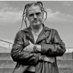
Using photos shot by future video director Dean Karr, Brown created Antichrist Superstar's impressive packaging and dual covers—the shirtless, spider-veined "worm" Manson on the front of the album's O-card slipcase, and the suit-and-tie "antichrist superstar" on the back—by incorporating more materials than he can recall. "You name it and it was probably used," he says. "I remember drawing some things and scanning in several layers of dirt that I used in the process."

The significance of the words "Heart, Mind, Complacent, Malice" on the album's front cover has been the subject of much debate among Manson enthusiasts, but their design dates back to Brown's pre-Manson career. In fact, it's these words that may have landed him the Antichrist job to begin with. "Those words were on one of the fake album covers I sent to Manson originally," he explains. "I picked opposing ideals and turned them into a symbolic compass of sorts: Heart is the opposite of mind, and complacency is the opposite of malice. Strangely enough, all of those things fit into the concept of the album. The exact graphic I used for the fake albums was used for the final package. I'm pretty sure that's why Manson hired me for the design."
Manson liked the finished package so much that he hired Brown to work on his next three albums, 1998's Mechanical Animals, 2000's Holy Wood, and 2003's The Golden Age of Grotesque. "I've probably designed several hundred album covers in my career, but Antichrist will always stand out," Brown enthuses. "One of my proudest moments was seeing a picture on the cover of the Wall Street Journal of Senators Orrin Hatch and Joe Lieberman holding the album package up in front of the Senate. They were pointing out the harm that the music industry was doing to all of the sweet, innocent children of America."
Below, watch Marilyn Manson play "The Beautiful People" with Johnny Depp in 2012:


